Are you tired of your plain and borrowing solid colors throughout your home? While solids all have their place, aren’t your interiors more fun when we add whimsical patterns that add visual interest and contrast? Yes! Mixing and matching patterns can often be a challenge, especially if you don’t know how to choose the right complimentary colors and scale of patterns to use amongst each other. Before you start choosing patterns randomly there are a few tips that will steer you straight. Here are 10 easy ways to mix and match patterns with ease in your home.
1. Determine what color palette you love first:
One of the challenges of mixing and matching patterns is the ability to determine what will look good together and what will clash. Before you concern your mind with pattern, look to a color palette that you love first. When choosing colors decide if a warmer colors or cooler colors will work best. There are warm and cool sides of every color so choose one or two main colors and consider one or two accent colors to deliver a pop of character.
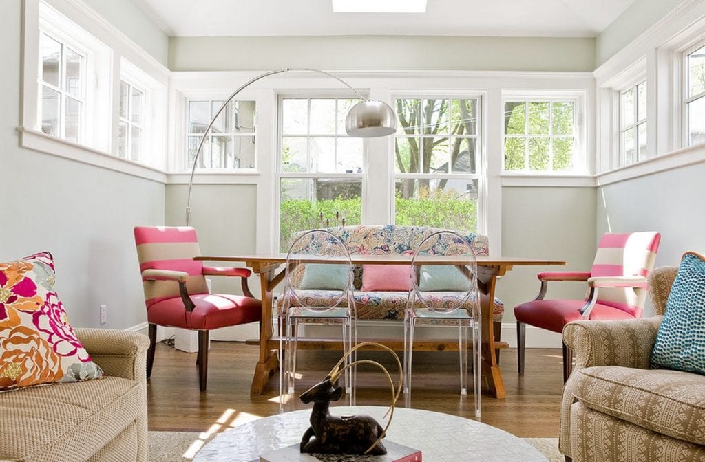
2. The simplest route: combine white plus a colored pattern
One of the simplest ways to combine patterns is to choose one colored pattern combined with white background. Whether you choose a monochromatic scheme in white and black, or decide on a nautical theme with navy blue and white, use your imagination when choosing a color scheme. Then introduce patterns of that color in stripes, polka dots, chevron stripes, bold prints, whichever prints create a statement without being an overabundance for the eyes.
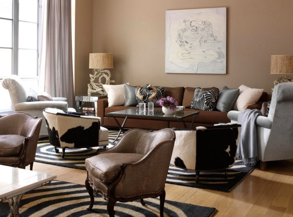
3. Let neutral colors become your base when using large prints
Bold or large prints can be used tastefully when mixing and matching patterns. Another general rule is to start off with a neutral color on the walls and flooring and use a few layers of bold prints in either your area rug, or in a few key pieces of furniture. Then fill in your space with neutral colored sofas, chairs and ottomans to neutralize the room. The bold patterns will work magically with the subdued neutral tones.
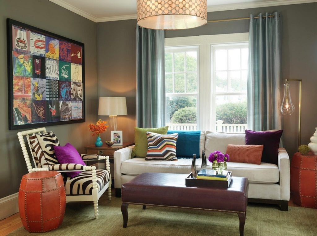
4. Use a variety of scales when mixing and matching patterns
When choosing patterns in your interiors remember that large-scale patterns can intermingle with smaller scale prints as long as the color palette stays in the same color family. Choose a dominant print from artwork or your window treatments and then select smaller scale patterns for accent pillows, and textiles throughout your interiors. The more variety of scale in your patterns, the more comfortable and welcoming the space will feel.
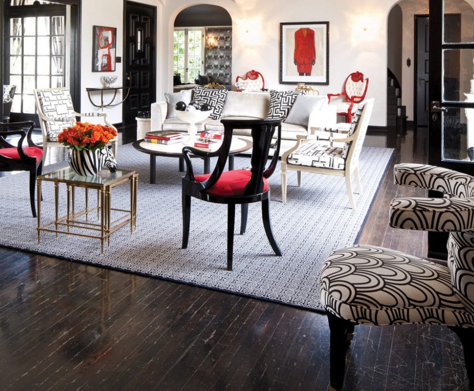
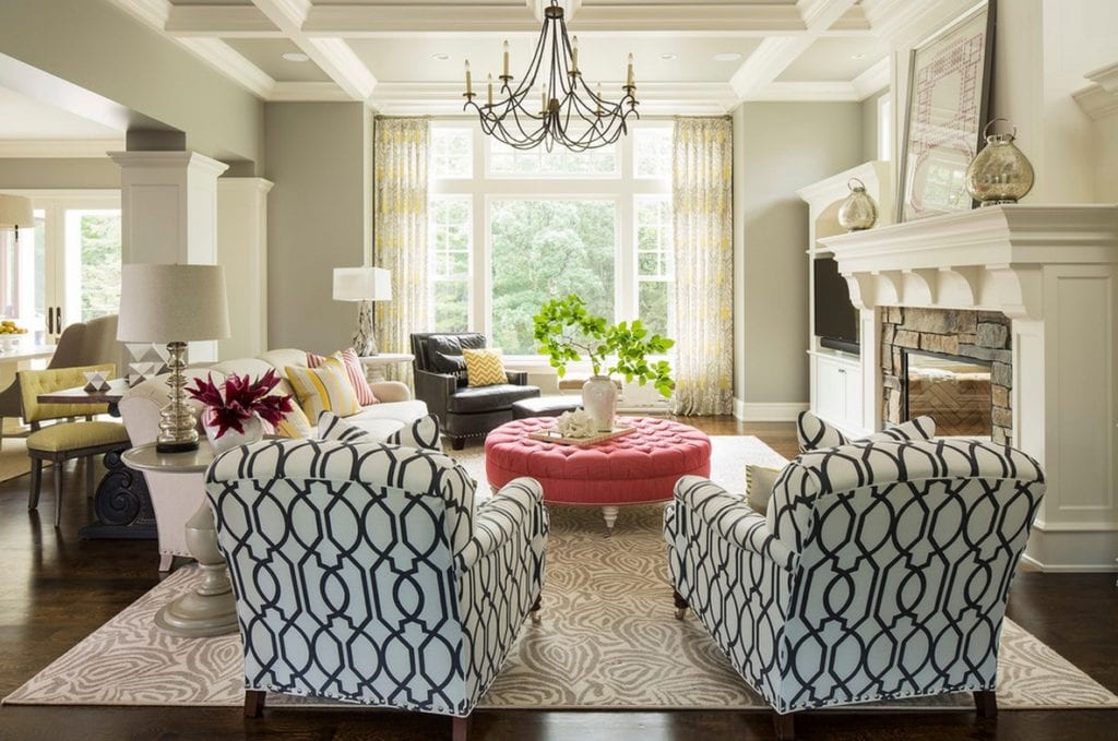
5. Don’t shy away from bold colors and prints
The wonderful part of choosing patterns to mix and match is the wide range of bold colors you can choose from. Jewel tones in rich burgundy; garnet red and aquamarine blue can look lovely on your zebra print side chair! Choose prints that have a monochromatic design and that don’t compete visually with the bold colors around it. This living room does a beautiful job of using a neutral colored wall paint and combining it with just the right amount of colors and patterns to give a wow factor. Remember you don’t just have to choose pastel colors in your interiors, bold colors can be exciting and invigorating!
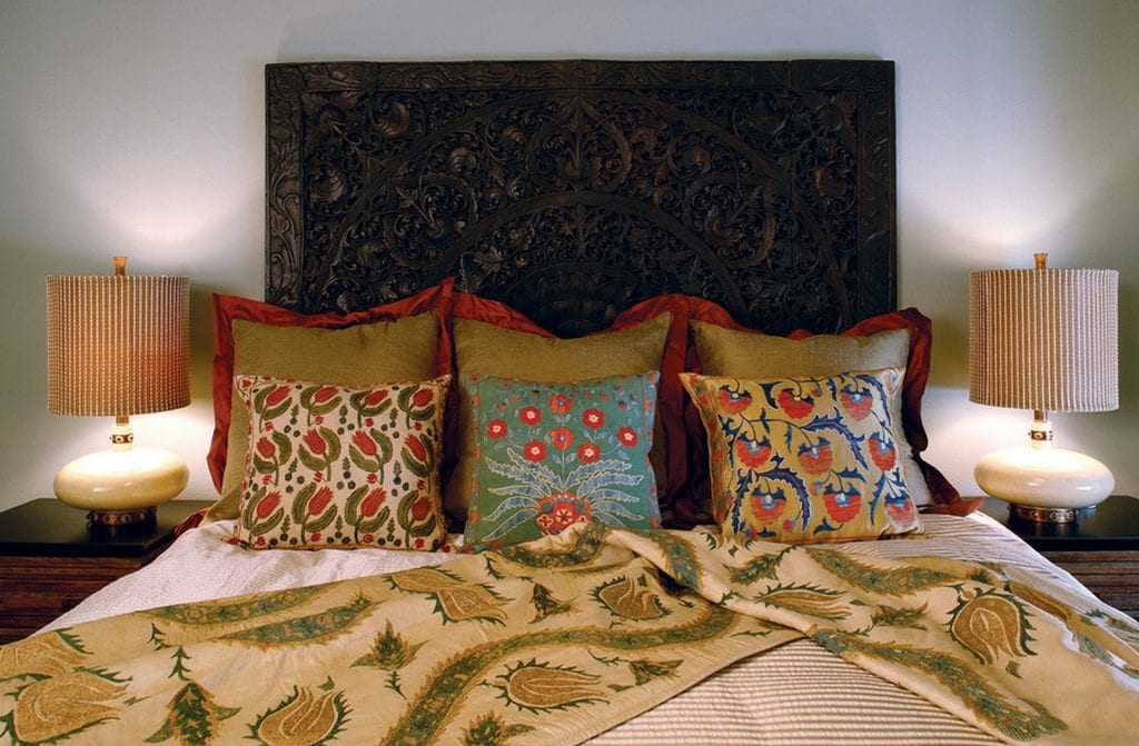
6. Find a pattern you love and mimic it in your decor
If you are a fan of gingham stripes or plaid patterns, or even polka dots, why not mix and match these patterns in alternating decorative textiles? Your bedroom is great room to try this in. Bedding, accent pillows, window treatments and lampshades can all borrow varying scale versions of these wonderful prints. Introduce solid colors for sheets, coordinating accent pillows and an area rug to bring a balance to the patterns your love.
7. Tone on tone color helps prints neutralize your space
In recent years tone on tone color or the ability to choose varying saturations and tint levels of the same color in your interiors has made interior decorating much easier. Using varying shades of chocolate brown, grays, white, and greige can mix and match patterns easily because the outcome is a mixture of varying levels of impact. Stick to choosing one or two decorative items that have a large impact print and then tone down the other furnishings with a tighter and smaller dynamic print.
8. Find inspiration in the details of patterns and prints
For many homeowners the thought of choosing wallpaper, drapery, fabrics, and other decorative finishes makes them more confused as to what they really like to embrace in their interiors. Instead, choose a piece of wall art you love, or an ottoman that has a beautiful color and seek inspiration from it. Find patterns and prints that embody your focal point piece, or that match complimentary in color and style to it. These will save your mind from being overwhelmed and will ensure you love the outcome you decide on.
9. Choose prints and patterns from your recent travels
Visiting other countries and traveling the world can bring about an amazing collection of fabrics and textiles from your travels. Use these patterns and prints and mix and match them with solid colored hues in your living spaces or even on your bed to bring life to your dull room. You will be surprised how just a few native fabrics from your most recent and favorite destinations will create an interior you love!
10. Consider using wallpaper to add no-fuss patterns
While you may only be thinking about textiles, remember patterns can be brought out through your wallpaper. Wallpaper creates an easy to way to showcase your love for bold or subtle prints in the background, without overpowering your furnishings. If you choose a very big and bold print, consider using this on an accent all behind your bed or dining room table wall and then using a smaller print or even paint on the adjacent walls. This will help keep the room balanced and comfortable to the eye and mind.
Freshome readers how do you mix and match patterns in your interiors?
No comments:
Post a Comment